Did you know you can view multiple charts at once in HR Case Management?
Comparing multiple charts’ data while viewing them one at a time can be tedious.
The Multi-Chart Dashboard configuration allows service users—service administrators, service managers, and service agents—to view multiple charts at once.
Setup administrators choose the charts that service users can select for their multi-chart view dashboards.
The Multi-Chart Dashboard Arrangement
The multi-chart dashboard can include one, two, or three tabs.
Service users can select up to nine charts maximum to display on each tab.
Charts on each tab appear in grid format. For each tab, service users select a position for each chart: from 1 to 9.
Row 1: Positions 1, 2, and 3
Row 2: Positions 4, 5, and 6
Row 3: Positions 6, 7, and 9

Benefits
• Service users are not limited to viewing a single chart at a time.
• Service users can assess data and trends more effectively in multi-chart view.
• Service users can group charts with similar data together. For example, all charts that log and track SLA information can be grouped in the same grid.
• Service users can personalize their own unique multi-chart displays.
• Customers can enable the multi-chart view for all service user roles or restrict it to a specific role.
Enabling the Multi-Chart Dashboard Feature: Steps
1. Log into the portal as a setup administrator (CMsetup), access the portal menu, and navigate to Case Management Admin > Application Settings.

2. On the Applications settings page, scroll down to the Multi-Chart Dashboard area. For each role, click the switch to set it to “Yes” as appropriate, then click Update.

Configuring Dashboard Chart Layouts: Steps
1. Log into the portal as a setup administrator (CMsetup), access the portal menu, and navigate to Case Management Admin > Dashboard Layouts.

Notes:
The Dashboard Layouts menu items are for selecting which charts appear on the Dashboard Configuration page for each service user role. Service users access the Dashboard Configuration page to select which of these charts appear in their personalized multi-chart view of their dashboard.
The Dashboard Chart Layouts menu items are for selecting which charts appear on the Charts Configuration page for each service user role. Service users access the Charts Configuration page to select which of these charts appear in their personalized view of the Charts menu. Service users can select a chart from the Charts menu to view each chart individually—there is no multi-chart view.
2. In the Dashboard Layouts drop-down menu, select a service user dashboard type:
• Admin Dashboard
• Agent Dashboard
• Manager Dashboard

3. On the role-specific Dashboard Layouts Configure Dashboard page, a list of all available charts for the service user role type appears.
Charts with “Yes” in the Display column will appear on service users’ Dashboard Configuration page as per their role.
To change a chart’s Display setting (“Yes” or “No”), double-click on the entry in the Dashboard column, change the setting, then click Update.

Every chart with Display = “Yes” requires an order number other than 0 (zero).
To change a chart’s Order setting, double-click on the entry in the Order column, change the setting, then click Update. Each chart requires a unique Order number.

Note:
Service users can set unique positions for charts on the Dashboard Configuration page for their own personalized multi-chart view. Charts’ order number on the role-specific Dashboard Layouts Configure Dashboard page does not hinder service users from setting unique chart positions.
Personalizing Dashboard Multi-Chart Layouts: Steps
1. Log into the portal as a service user with the enabled multi-chart dashboard feature:
• Service administrator (ServiceAdmin)
• Service agent (ServiceRep)
• Service manager (ServiceMgr)
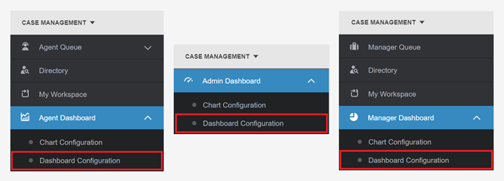
2. In the portal menu, navigate to Case Management and select a role-specific dashboard drop-down menu:
• Admin Dashboard
• Agent Dashboard
• Manager Dashboard
Then select Dashboard Configuration.
3. On the Dashboard Configuration page, on the Properties tab, enter text in one or more of the Tab fields to name each tab that will appear in the dashboard’s multi-chart display.
Character maximum per field: 50.
If left blank, the tab(s) will not appear in the dashboard.
Then click Update.

4. On the Dashboard Configuration page, on the Dashboard Configuration tab, the list of all available charts appears.
To set a chart’s Tab setting, in the Dashboard column, enter 1, 2, or 3, then click Update.
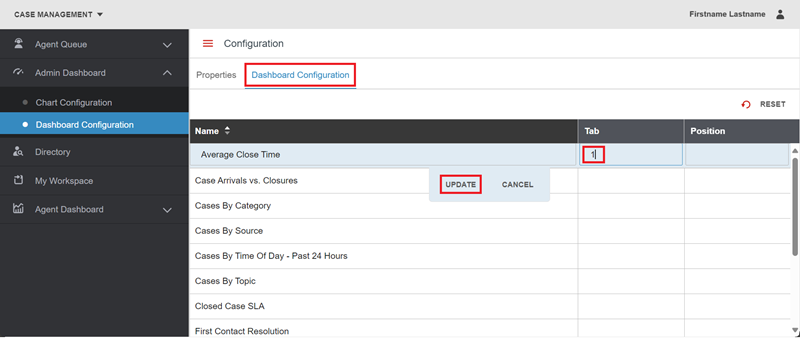
To set a chart’s Position on a tab, in the Position column, enter any number from 1 through 9, then click Update.

Each tab can contain up to nine charts, three per row, in grid format.

5. Refresh the browser.
6. In the portal menu, navigate to Case Management and click on the role-specific dashboard menu item:
• Admin Dashboard
• Agent Dashboard
• Manager Dashboard
Select the Dashboards menu item to access the multi-chart view.

For questions or more information, contact your HRSD Advisor (Customer Success Manager (CSM)).
Please Send Your Feedback!
We encourage you to comment on this post—and any of the other posts on the HRSD Community that apply to you.
Your feedback helps us to improve our products and add enhancements to make them as useful to you and your employees as possible.
Thank you in advance!
