Did you know that service users can filter all dashboard charts by user groups in HR Case Management?
About Dashboards
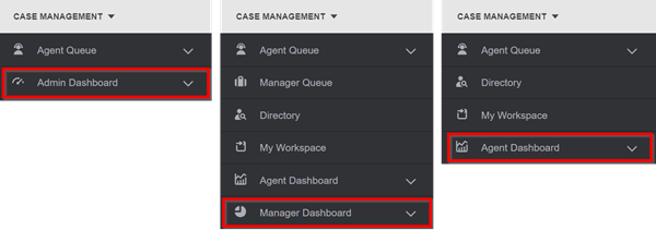
HR Case Management offers three dashboards.
• Admin Dashboard for service administrators
• Manager Dashboard for service managers
• Agent Dashboard for service agents
Each dashboard includes various charts for monitoring case activity. Charts display case data in pie chart format.
Filtering Dashboard Charts by User Group
Previously, service users could only filter dashboard charts by populations or service groups.
Now service users can also filter dashboard charts by user group.
In this context, "user groups" pertain to the user groups of the employee on the case, not the service user.
Details
• Setup administrators can enable and disable the user groups for each dashboard.
• For each dashboard chart, service users can choose user groups via the "Groups" selection in the "More" menu.
• The "Groups" selection is available in both single chart and multi-chart views.
Benefits
Visibility
Service users can run metrics to determine which user groups have the most and least cases.
Convenience
Service users can view data for all user groups or one individual user group.
Flexibility
Administrators can configure each dashboard with unique user group settings.
Specificity
Service users can filter out unnecessary data when viewing dashboard charts.
Transparency
Service users can easily compare data between individual user groups.
Enabling Dashboard Chart User Group Filtering: Steps
1. Log into the portal as a setup administrator (CMsetup).
2. Access the portal menu.
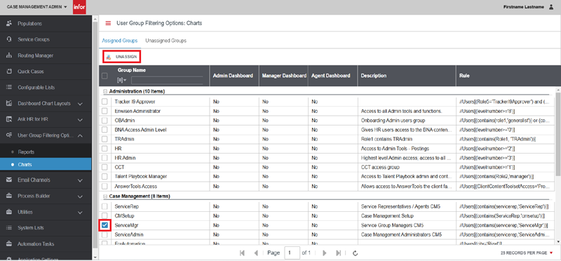
Navigate to Case Management Admin > User Group Filtering Options > Charts.

3. The User Group Filtering Options: Charts page appears.
The Assigned Groups tab indicates all user groups available in the dashboard charts.
To remove a user group, tick its check box, then click Unassign.
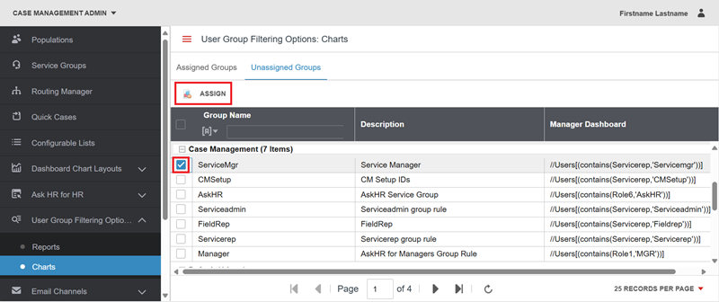
4. To add a user group, click the Unassigned Groups tab. Tick a group's check box, then click Assign.
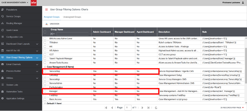
5. Access the Assigned Groups tab. Columns appear for:
• Admin Dashboard
• Manager Dashboard
• Agent Dashboard
To add user groups for filtering to a dashboard (and thus all of its charts):
For each group, click on the dashboard entry to change it setting from No to Yes.
Using Dashboard Chart User Group Filtering: Steps
1. Log into the portal as a service user.
2. Access the portal menu and navigate to Case Management.
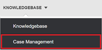
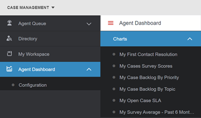
3. In the Case Management menu, click on a dashboard:
• Admin Dashboard;
• Manager Dashboard; or
• Agent Dashboard.
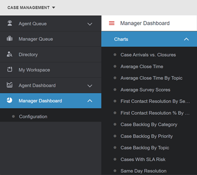
4. In the dashboard's submenu, click Charts.
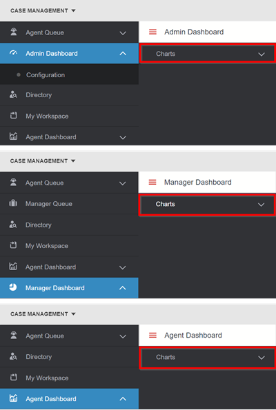
5. In the Charts list, select any chart.
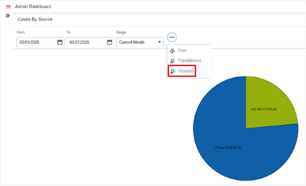
6. The chart's page appears. Click the "More" menu icon (three dots), then click Group(s).
7. The Group Filter pop-up appears. All configured user groups are selected by default.
Tick groups' check boxes to deselect them, then click Apply.
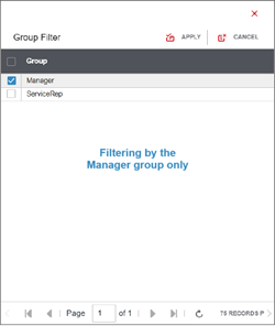
The chart reappears with data for the selected user group(s) only.

For questions or more information, contact your HRSD Advisor (Customer Success Manager (CSM)).
Please Send Your Feedback!
We encourage you to comment on this post—and any of the other posts on the HRSD Community that apply to you.
Your feedback helps us to improve our products and add enhancements to make them as useful to you and your employees as possible.
Thank you in advance!
